
Squarespace Fluid Engine vs. Classic Editor
I’ve been using Squarespace for more than a decade (since version 4 I think…). I’ve seen their various iterations over the years and, let me tell you, they’ve really come a long way.
Today, in version 7.1, it’s matured into a beautiful and elegant design platform. As you can see, I am a fan.
There are two main editing environments today: The Fluid Engine and the Classic Editor. And the great thing is that you can use any combination of the two on the same page in Squarespace because it’s based on the page Section. Each section has the option of Classic or Fluid. And for that I’m very thankful. As I’ll be explaining below, each type has its pros and cons, and having the option instead of being forced to use one or the other makes things so much easier.
There are plenty of Squarespace help articles and blogs out there explaining the technical differences between the two. This post is to simply share my experience using the two editors and my process when deciding which one to use.
So which one do I use?
Here’s the quick answer, and then I’ll explain why: I ALWAYS start with the Classic Editor.
If you’ve used Squarespace long enough, the reason why is fairly self-explanatory. If you create a new Classic Section, you can at any time “Upgrade” that section to a Fluid Engine section. But once a section is a Fluid Engine section, it cannot be “downgraded” back to a Classic section. So it seems to make logical sense to me to start as a Classic section and “upgrade” if needed.
Why I prefer the classic Editor
But, even though the reason above is valid, I still prefer the Classic Editor to the Fluid Engine.
There’s several reasons, but the biggest is that it’s just simpler. Most of the time, simpler is better. It’s easy to get caught up into making websites that dazzle and sparkle. But that’s a little gimmicky, and in my experience, gimmicks don’t convert shoppers into buyers. Flashy websites will get attention, but in most cases, people just want to find the information they’re after quickly and move on. Whether that’s a phone number or address, a quick purchase, or an answer to a question, people don’t really want to waste time wading through a gimmicky website.
And the Classic Editor is just that: simple. It’s really easy to get caught up into making sure everything looks just right and is in exactly the right spot. But that’s mostly just time wasted, because that’s generally not the way the web works. Websites in general (there are, obviously, exceptions) are designed to fill whatever container it’s poured into, and there’s no possible way to prepare for every single screen size (or container size, to continue the metaphor). Phones, tablets, laptops, and desktops of all sizes will be viewing your site. So trying to get everything exactly right for every screen size can be exhausting.
The Classic editor functions, for the most part, like the “pouring” metaphor, in that it simply fills the container—it just flows into whatever screen size is available and, for the most part, looks great. And it’s super easy to work with, without agonizing over exact placement. It just looks good on any size screen.
Why the Fluid Engine is also pretty awesome
All that said, there are times that more control over layout and placement is both helpful and necessary—especially for mobile screens.
Enter the Fluid Engine.

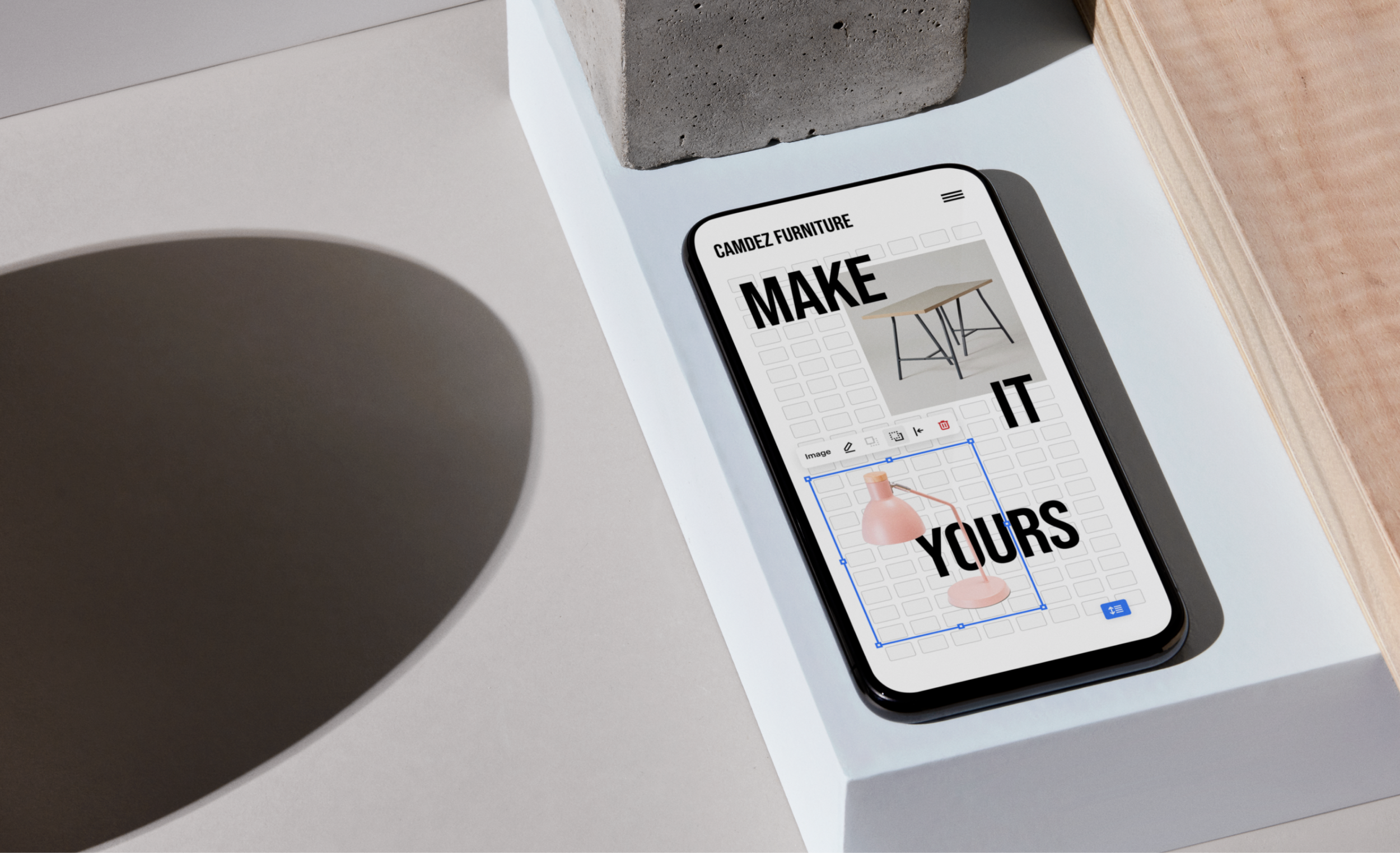
As you probably know, the Fluid Engine offers more control over “exact” placement of blocks for both a full-size screen and mobile screen. I put the word “exact” in quotes, because it’s still a bit limited, as I’ll explain in a moment.
The Fluid Engine allows you to have a layout for a full-size screen and a separate layout for mobile. This allows for the creation of some very cool designs, including layers, split-screens, and overflows. But these designs don’t always translate very well to mobile, so Fluid Engine lets you have a completely differently layout for smaller screens. This kind of control is very cool and very freeing.
However, the biggest drawback at the moment, is the screen size that’s left out of the equation: tablets—or anything in between desktop and mobile. This is why “exact” is in quotes above, because you still don’t get exact placement. As stated before, you can’t possibly prepare for every possible screen size, and since the web is designed to fit the container, or screen size, weird things still happen—especially for screen sizes in the middle.
Flow issues example
Take my website for example. On my home page, I have this seemingly simple box with a bubble at the top with an emoji in it.

To achieve this effect, there’s a text box layered on top of a white shape block that has curved corners (known as a border radius). Behind the white shape is another white shape that’s set to be a perfect circle. Only the top half is meant to be shown, so that it looks like it’s one object with a bubble on the top. Then there’s another text box with only the rocket emoji sitting on top of that circle.
I liked how that looked, so I went with it. The problem with this design becomes apparent when viewed on other screen sizes. It took a while to get it arranged just right so that the rocket was the right size even on smaller screens.
Here’s 2 shots of the same section, but on mobile. It’s split into 2 pictures because on mobile it get’s too long.


I think this looks pretty good too. The rocket is almost too big, but it’s the best I could get it to look.
Now, here is what the same section looks like on tablets (or other mid-sized screens).


See all that empty white space at the bottom of the second picture? That’s the tablet spacing issue that I’m referring to. The website has automatically adjusted to a mobile layout, but because the screen is bigger, the container is wider, and there’s more space for the text to flow horizontally. So the container fills up quicker, leaving all the blank space at the bottom.
But with Fluid Engine, there’s no tablet layout editor available, so you’re kinda stuck with that design.
I don’t know if the reason Squarespace doesn’t offer a tablet layout editor is a technical reason that’s above my pay grade to figure out, or if it’s something else. All I know is it’s not available.
There are some things you can do to minimize the issue. There’s a great Chrome plugin (that can be found here) that helps give you a better view of the tablet layout so you can make some tweaks. But those tweaks will affect the mobile layout too, so you have to make small tweaks.
In Short…
Both the Classic Editor and the Fluid Engine have their pros and cons. My best advice is to start with the Classic Editor, and upgrade to the Fluid Engine only if needed to achieve a specific layout. For most sections, the Classic Editor is just fine.
—Daniel
Was this helpful?
Got more questions about Classic or Fluid Engine Sections? Which one is your favorite, and why? Just leave a comment at the bottom of the page! 👇